HTML layout
LAYOUT
CSS is made from blocks and it allows you to place the content inside those blocks and control their properties, like width and height maybe the box shadow or the border.

you can use those dimension to control the box size and shape using HTML or CSS.
- Border the outer place of the box called a border, The border separates the edge of one box from another. If you changed a width for a box, then the borders, margin, and padding are all changed same as the border.
- Margin Margins sit outside the edge of the border. You can set the width of a margin to create a gap between the borders of two adjacent boxes.
- Padding Padding is the space between the border of a box and any content contained within it.
You can change a lot within a box, you can set a visible border and control its thickness, adding that you can round the corner to any degree you want, you can set a shadow beneath it and control how it spread, also, you can control the content inside the box by changing the dimensions for the margin and the padding, you can control a group of boxes and line them aside each other or as a column.
There are two types of elements, one that take a whole block and start a new line and ones who just take a small space that surrounds them. the first type called block-level elements and the other called inline element.
-
Normal flow Every block-level element appears on a new line, causing each item to appear lower down the page than the previous one.
- Relative Positioning This moves an element from the position it would be in normal flow, shifting it to the top, right, bottom, or left of where it would have been placed. This does not affect the position of surrounding elements; they stay in the position they would be in in normal flow.
- Absolute positioning This positions the element in relation to its containing element. It is taken out of normal flow, meaning that it does not affect the position of any surrounding elements.
- z-index
If you want to control which
element are on top, you can use
the z-index. Its value
is a number, and the higher the
number the closer tha element to the front.
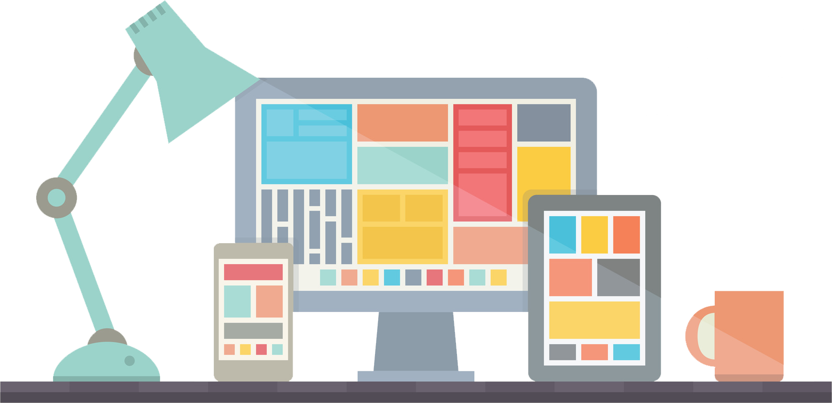
As you know, there a lot of devices to view the web these days, every device have different dimensions and developers need to adjust their codes to suit each screen, one way is to make the page responsive meaning that it changes its style depending on the screen dimensions, so developers are making digffrent commands for different screens.
Wireframes
A wireframe is a block diagram that shows the main elements of a web page layout as boxes with brief descriptions.

Developers use wireframes as reference map when they design pages, it saves a lot of time and reduce errors while maintaining a good progress.
Get back to EMAM’S HOMEPAGE
I have created this page as a part of my project using Github, Please visit my profile, I will be more than happy to hear from you all. © Emam Shararah 2021